


Identitydesign competition.
PROJECT:
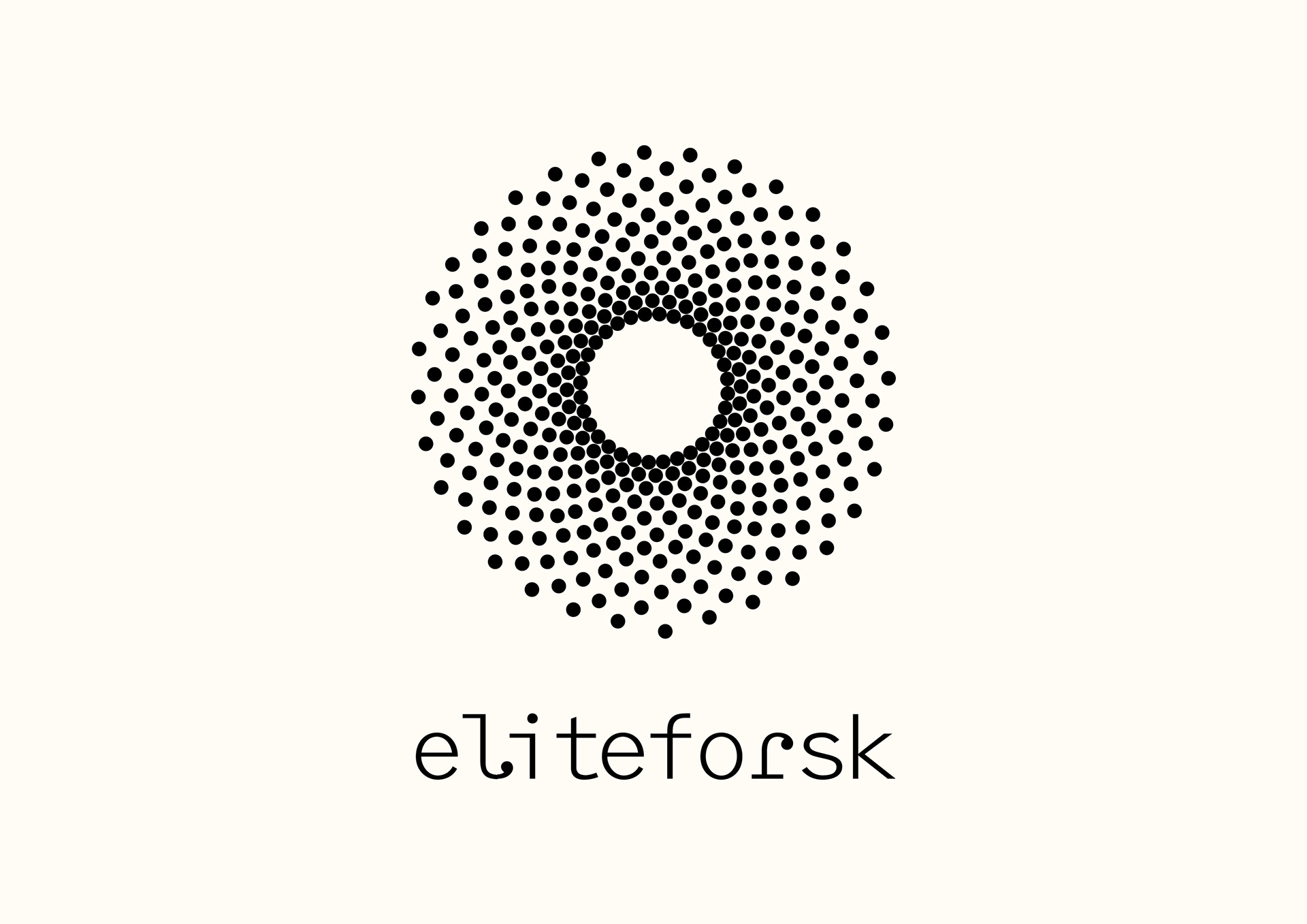
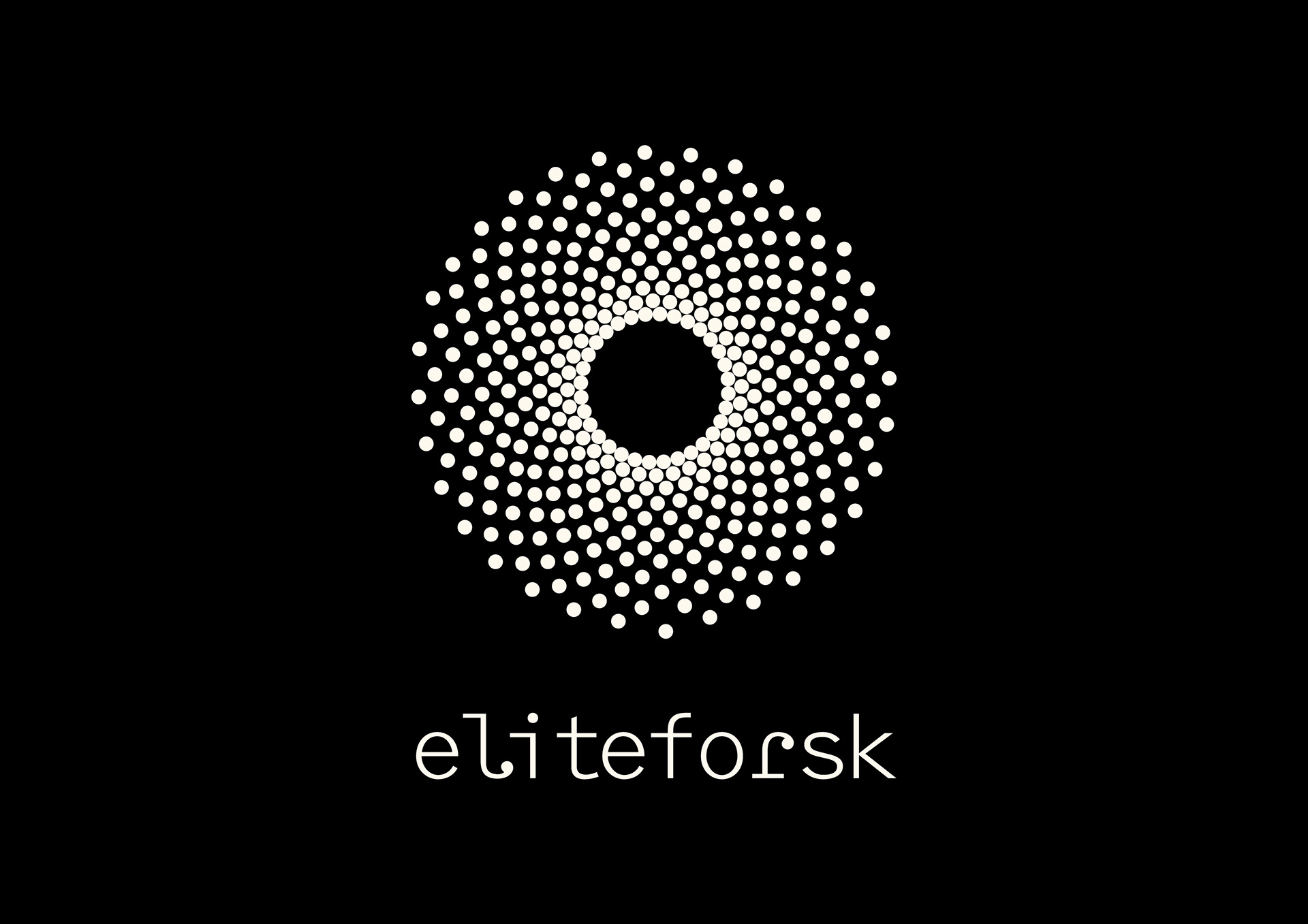
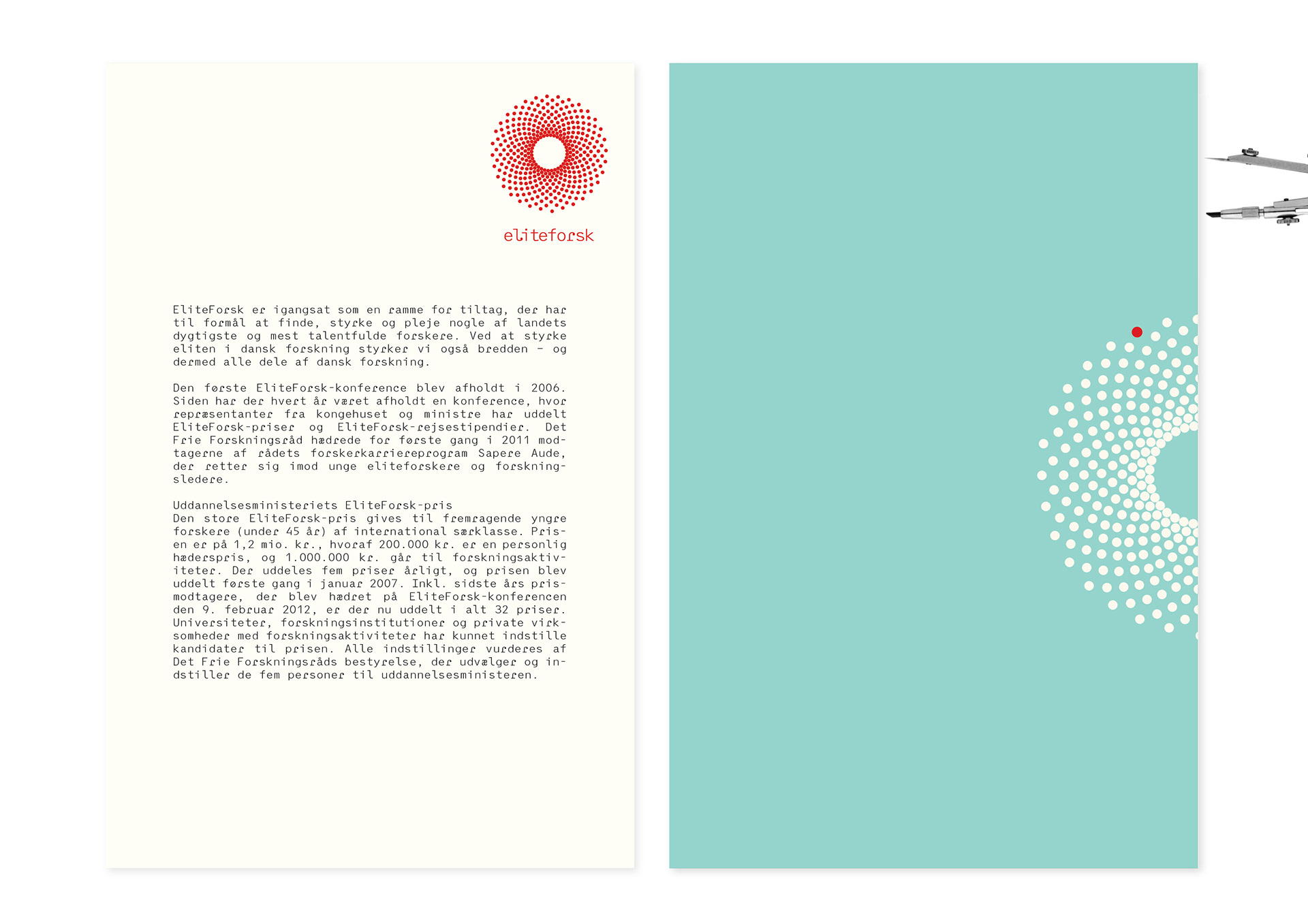
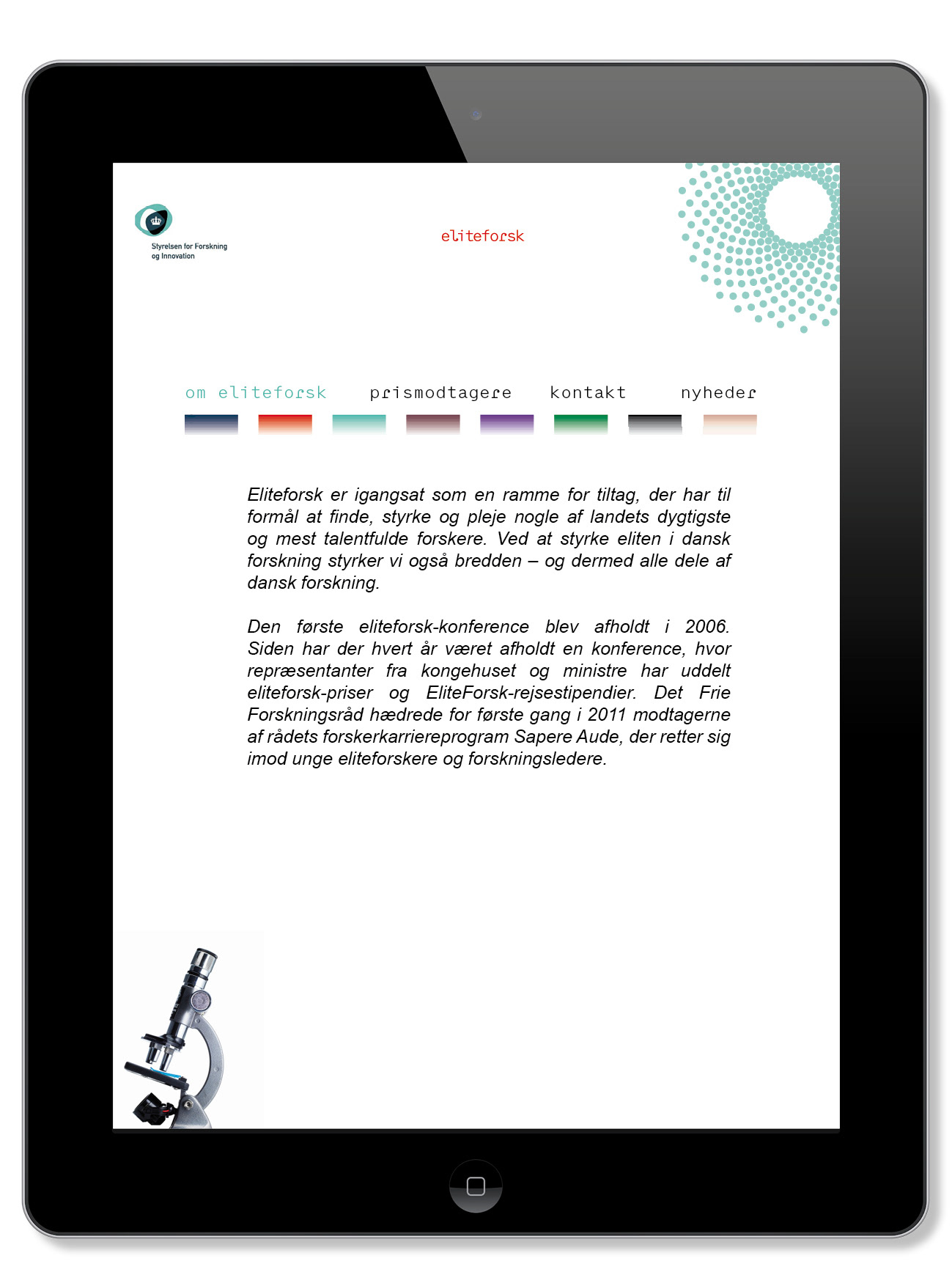
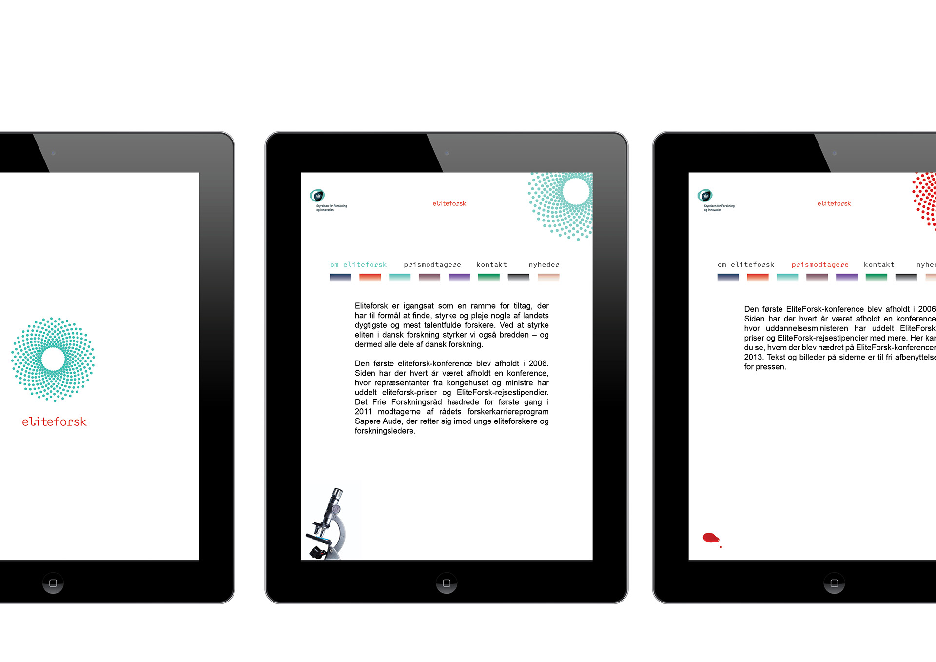
Designing a logo/logotype for eliteforsk - a research programme on an academic elite level to be launched by the Danish government through the ministry of education.
Designing a logo/logotype for eliteforsk - a research programme on an academic elite level to be launched by the Danish government through the ministry of education.
FOCUS / ISSUES TO ADDRESS:
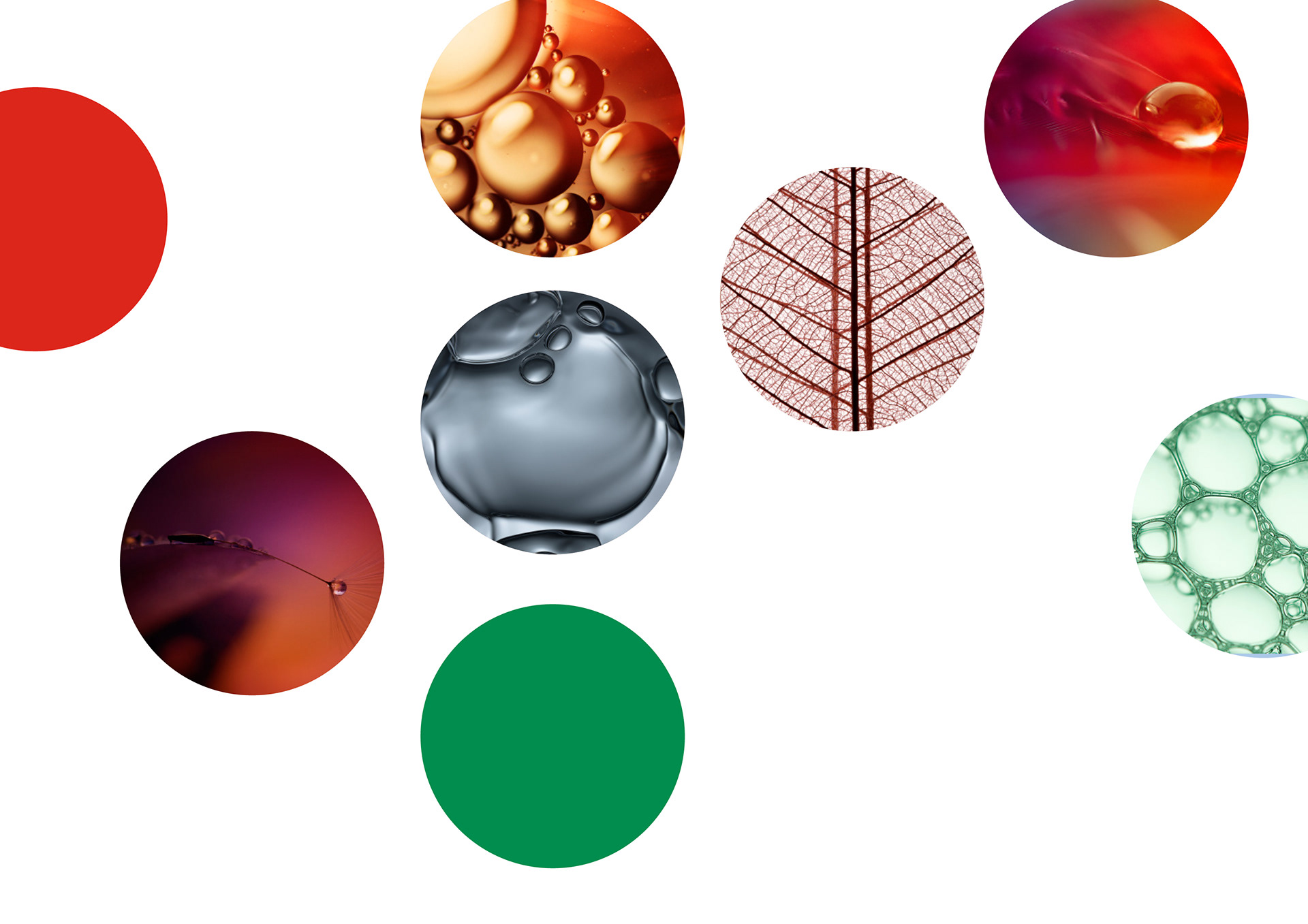
The motive was to design an icon/a symbol which could encapsule all fields of academic research, and put an emphasis on the duality of the meaning of the word eliteforsk: elite, the very best, and forsk with the double nuance of forskellighed (difference or uniqueness) and forsk (short for forskning i.e research).
The motive was to design an icon/a symbol which could encapsule all fields of academic research, and put an emphasis on the duality of the meaning of the word eliteforsk: elite, the very best, and forsk with the double nuance of forskellighed (difference or uniqueness) and forsk (short for forskning i.e research).
RESULT/ HOW IT WAS DONE:
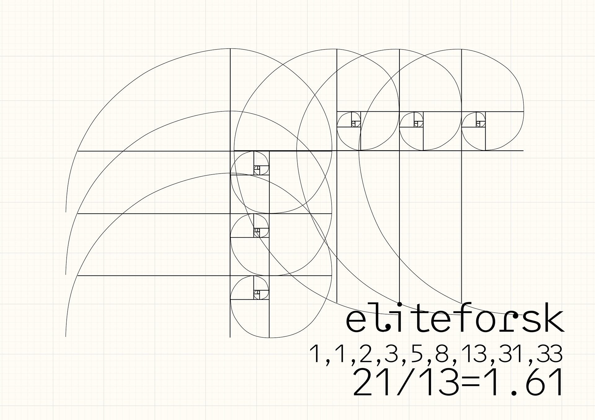
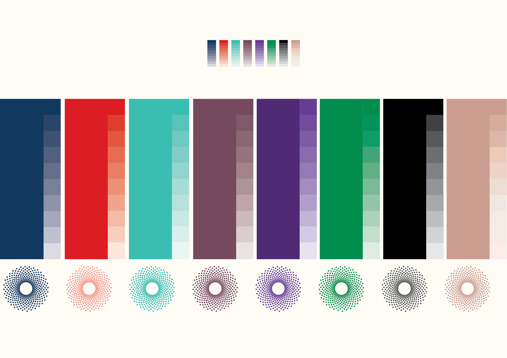
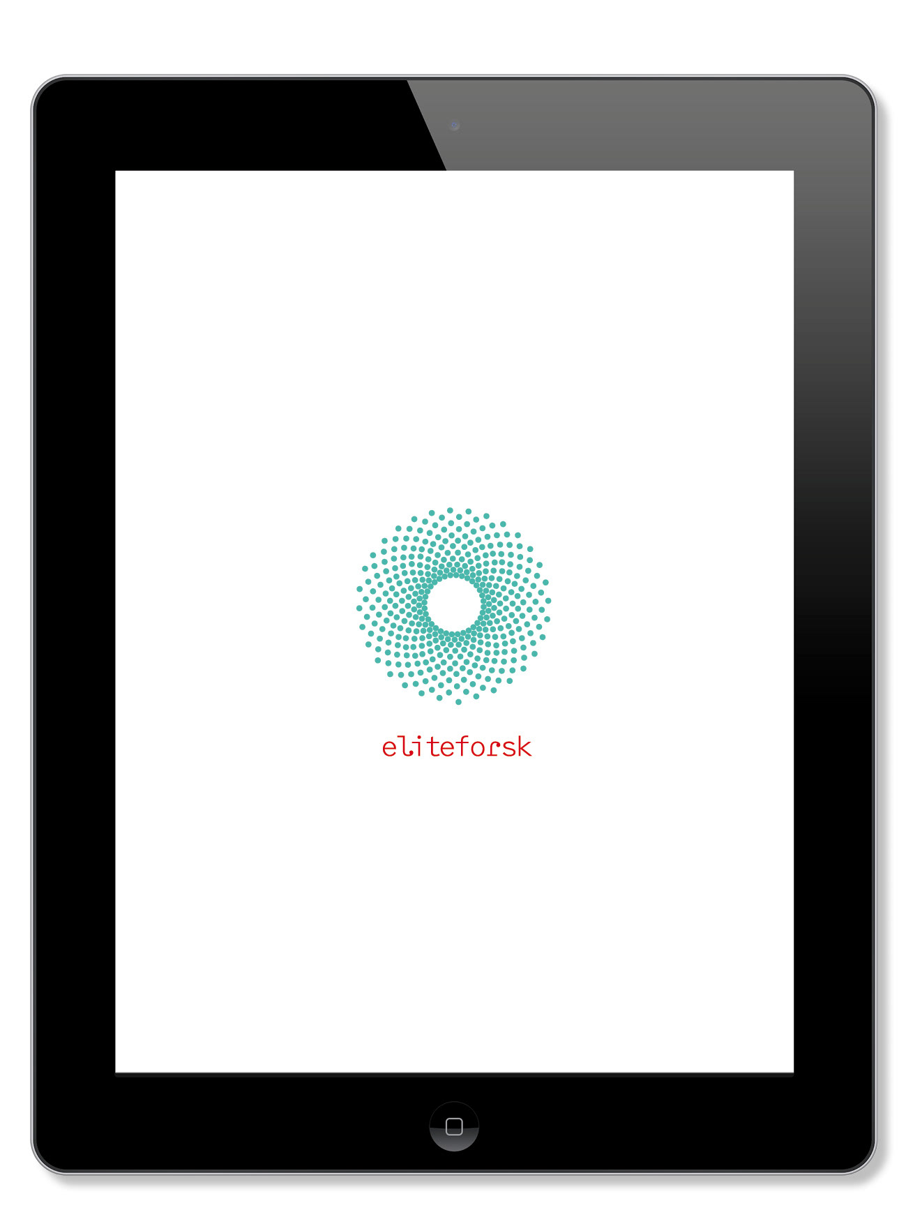
Taking an offset in the mathemathic sequence of Fibonnaccis spirale as inspiration, serving as a meassuring device, as well as a more abstract vision of the world.
Taking an offset in the mathemathic sequence of Fibonnaccis spirale as inspiration, serving as a meassuring device, as well as a more abstract vision of the world.
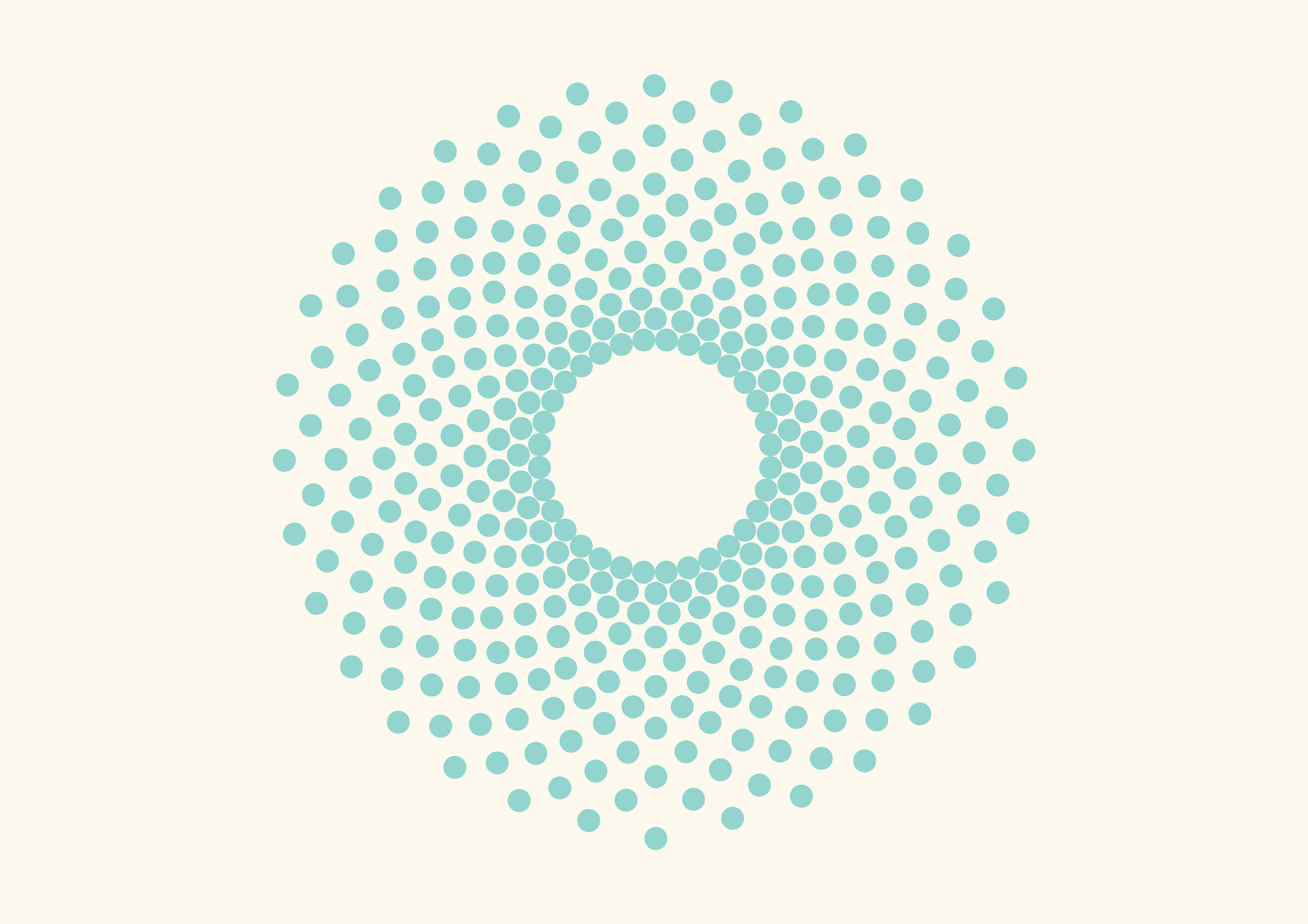
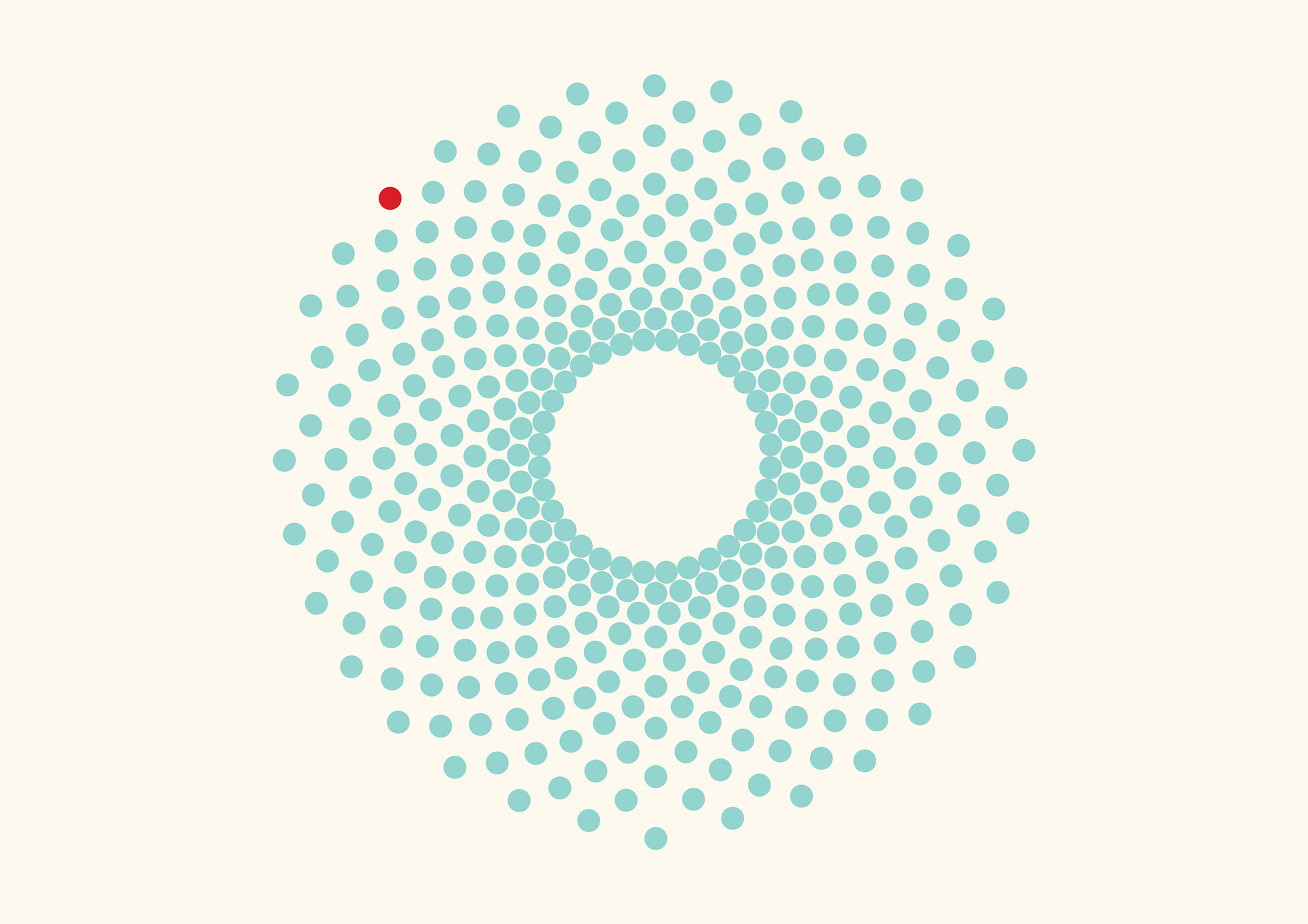
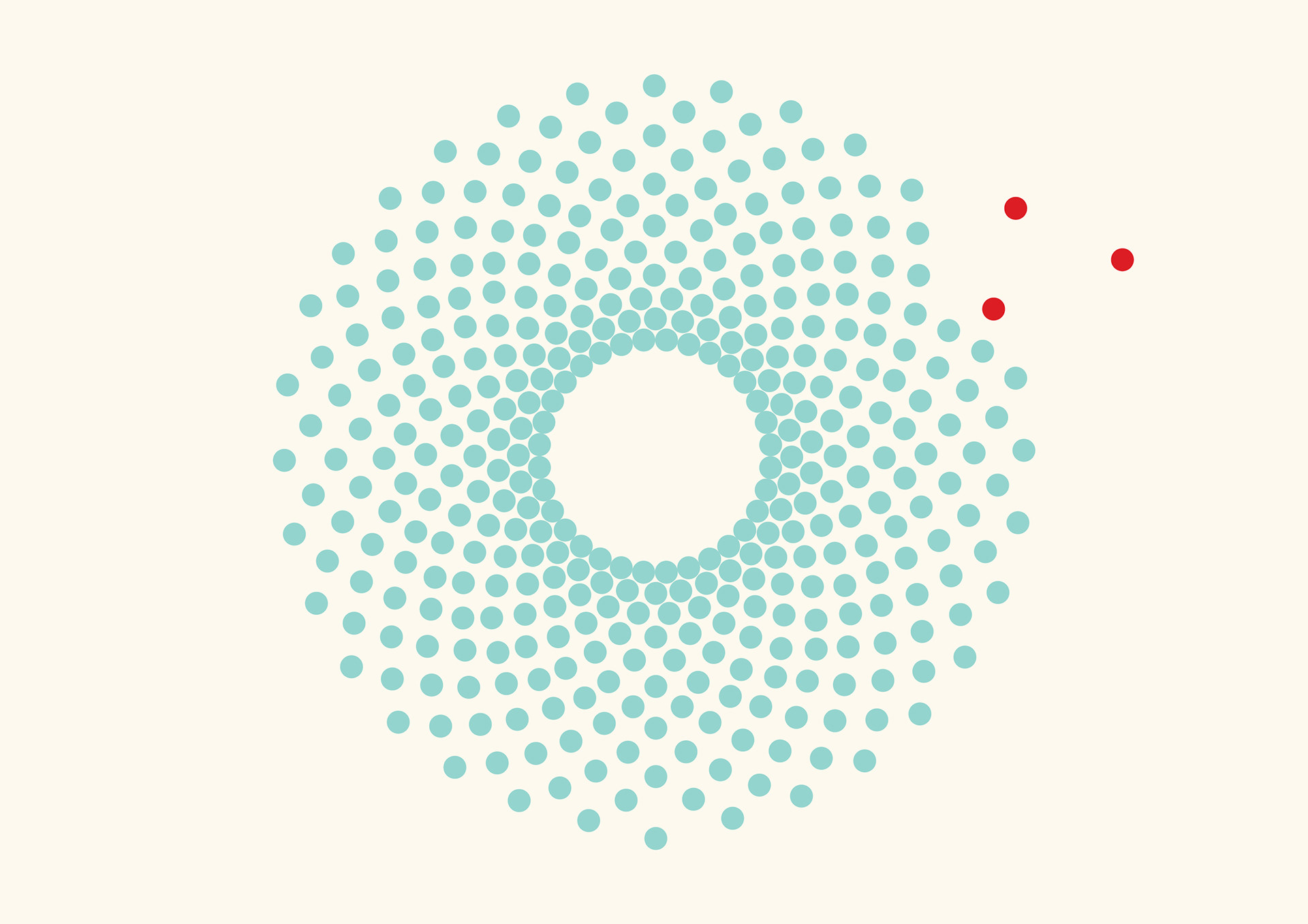
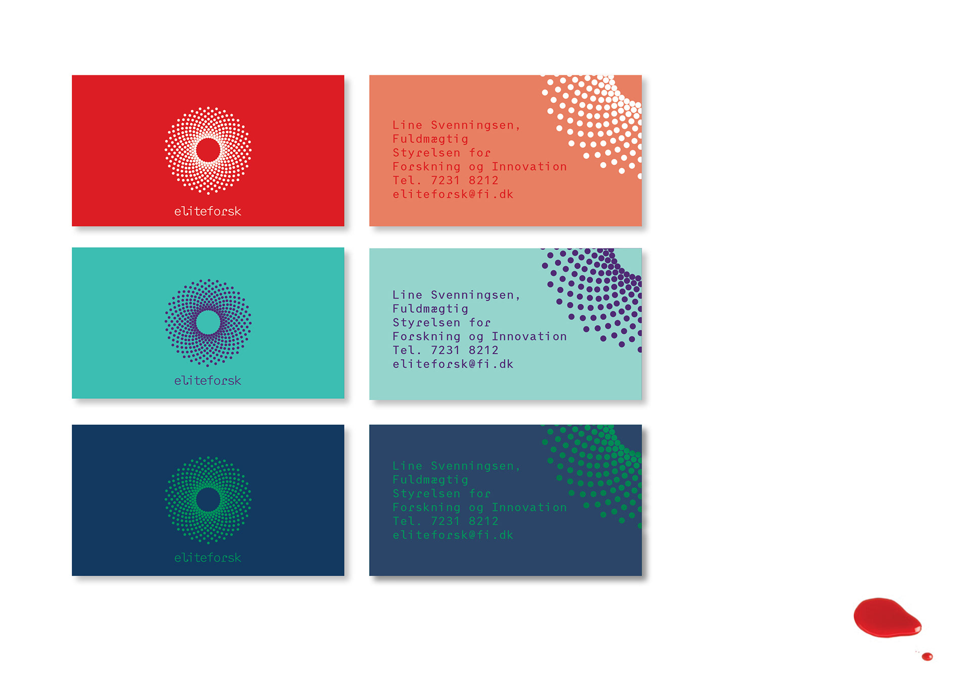
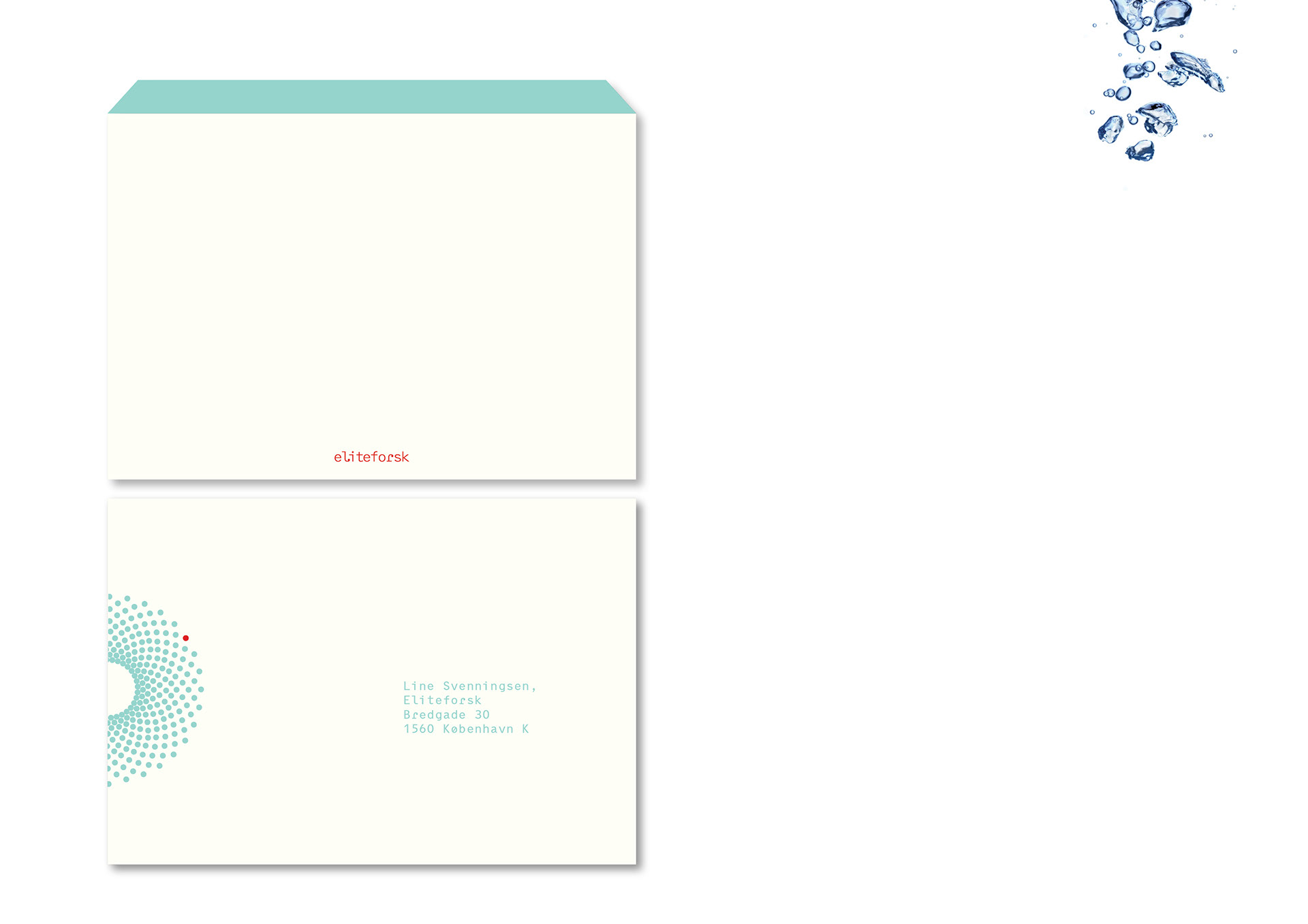
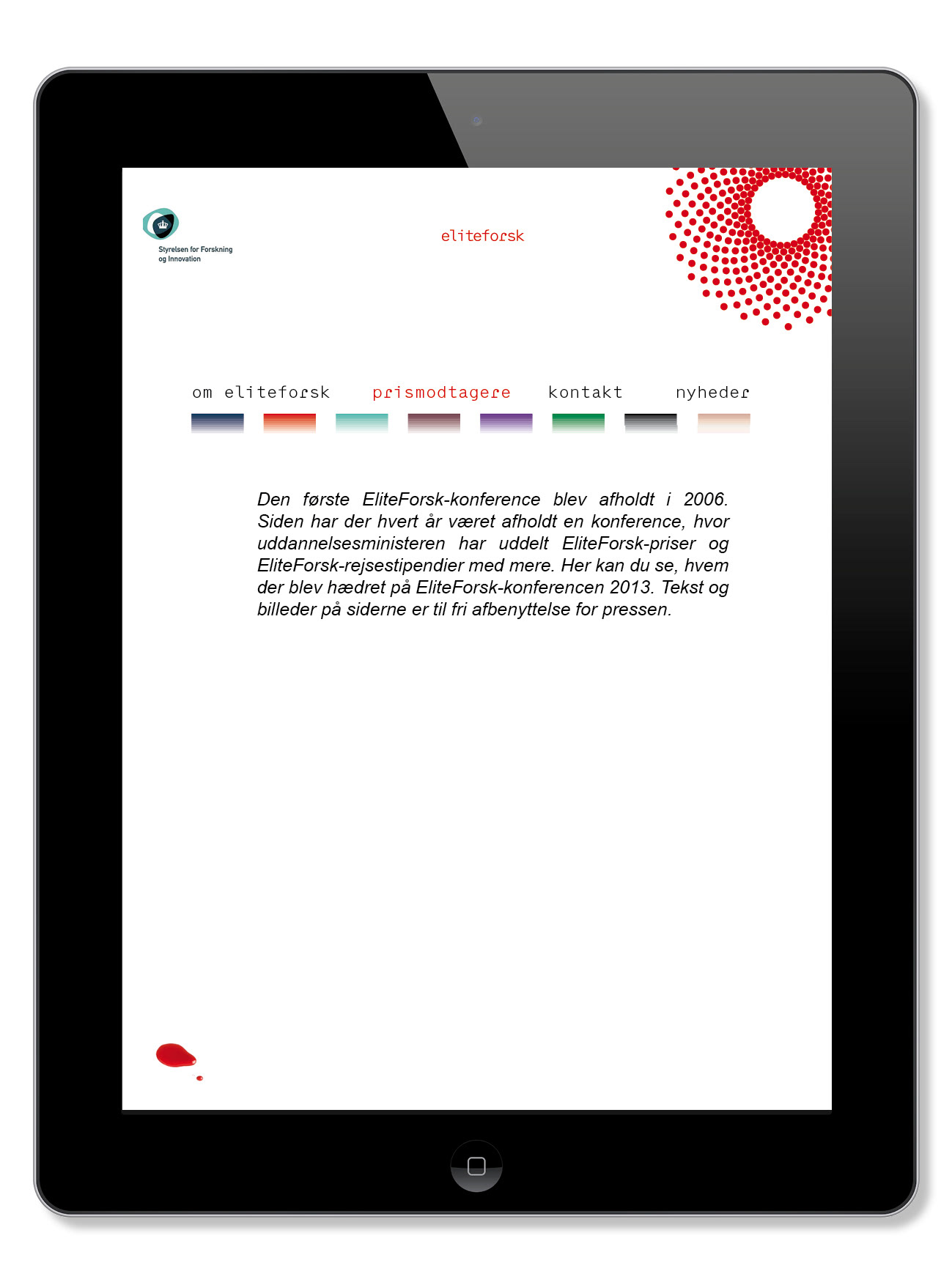
The dots each represent a unit, an element, or a brick of a larger picture. The thought is to underline the idea of a greater sum of knowledge as well as emphazising the importance of each single researchers contribution, with the possibility of a single dot being marked in a contrasting colour.
The logo-element is expressive in an non closed figure, an idea of a horizon opening up, as well as moving inward, rotating in a spiral-form for a centre or core of new understanding.
The different expertise and professional fields of research is represented and illustrated by the logos versatility in use.
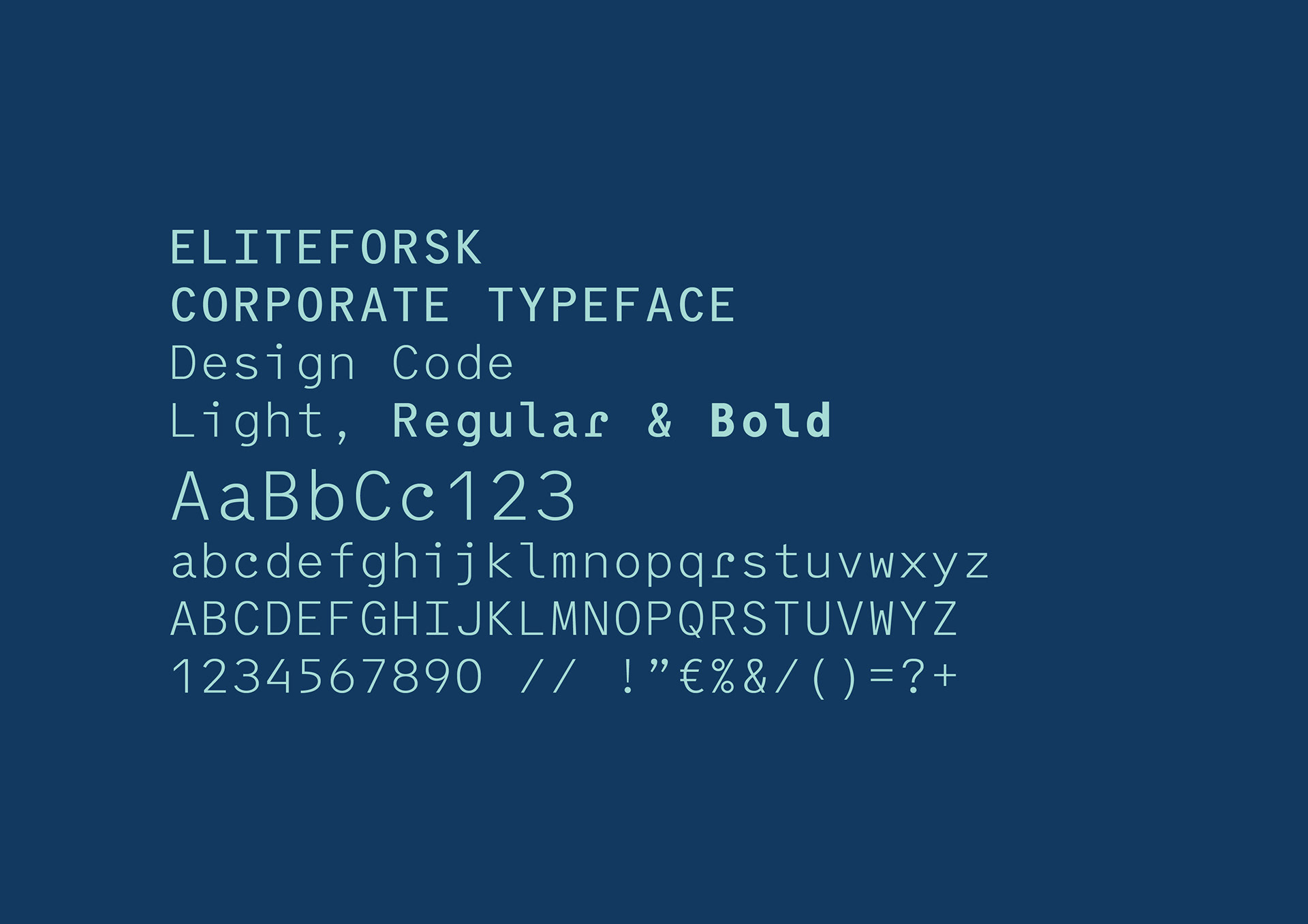
The logo-type is based on a typeface of mathematical structure, designcode (designed by designagency e-types), but with a re design-twist, where the dots are incorporated into a softer spiralling function in the L and R.