

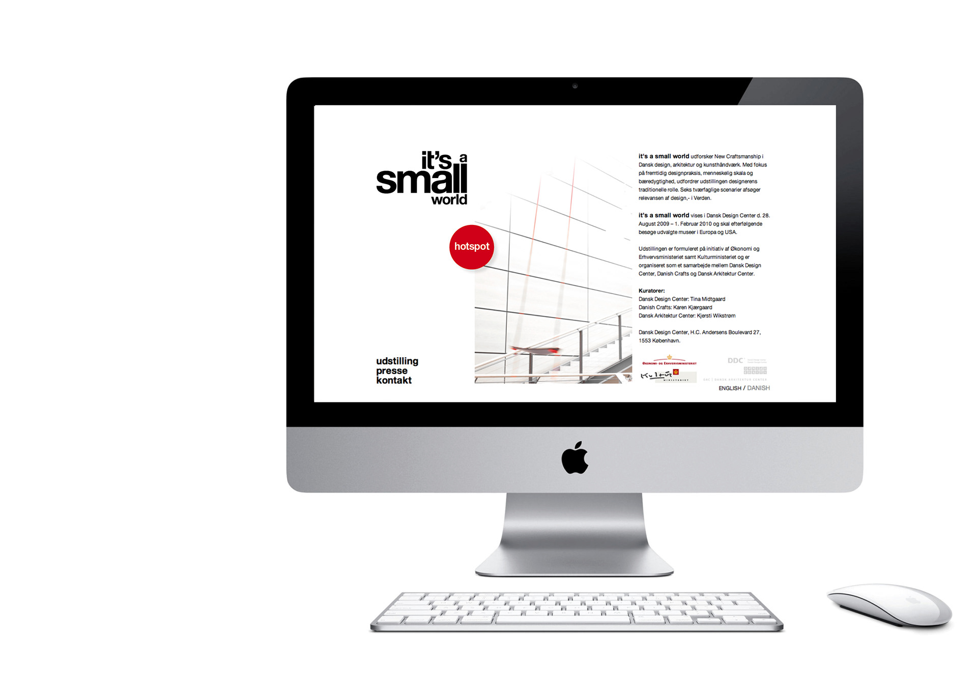
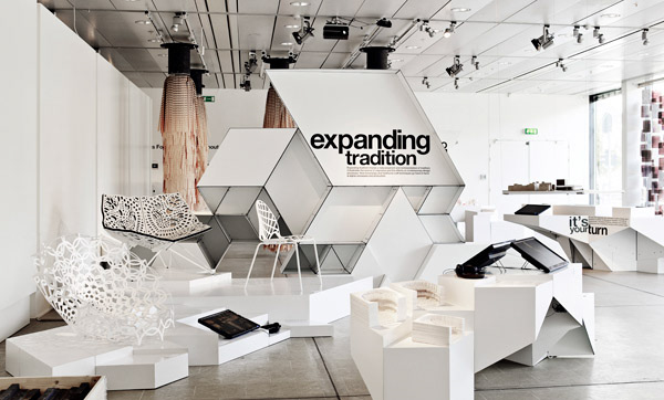


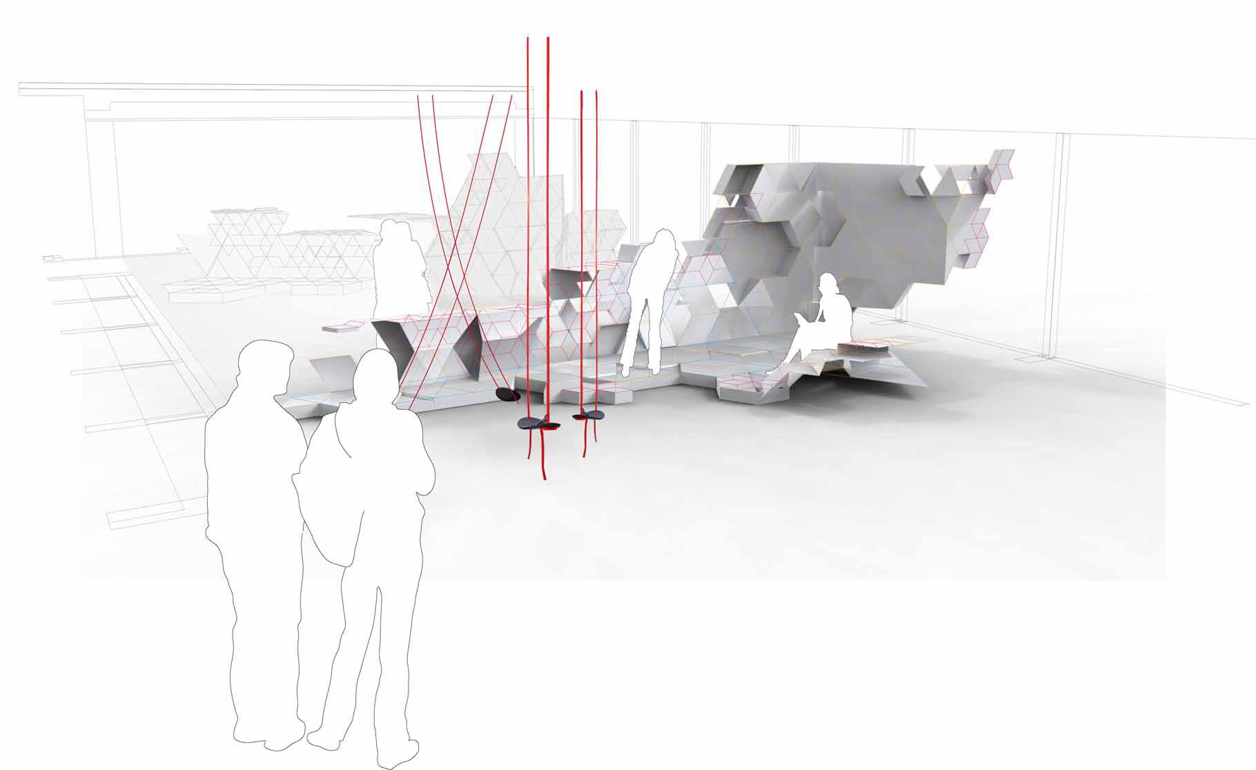
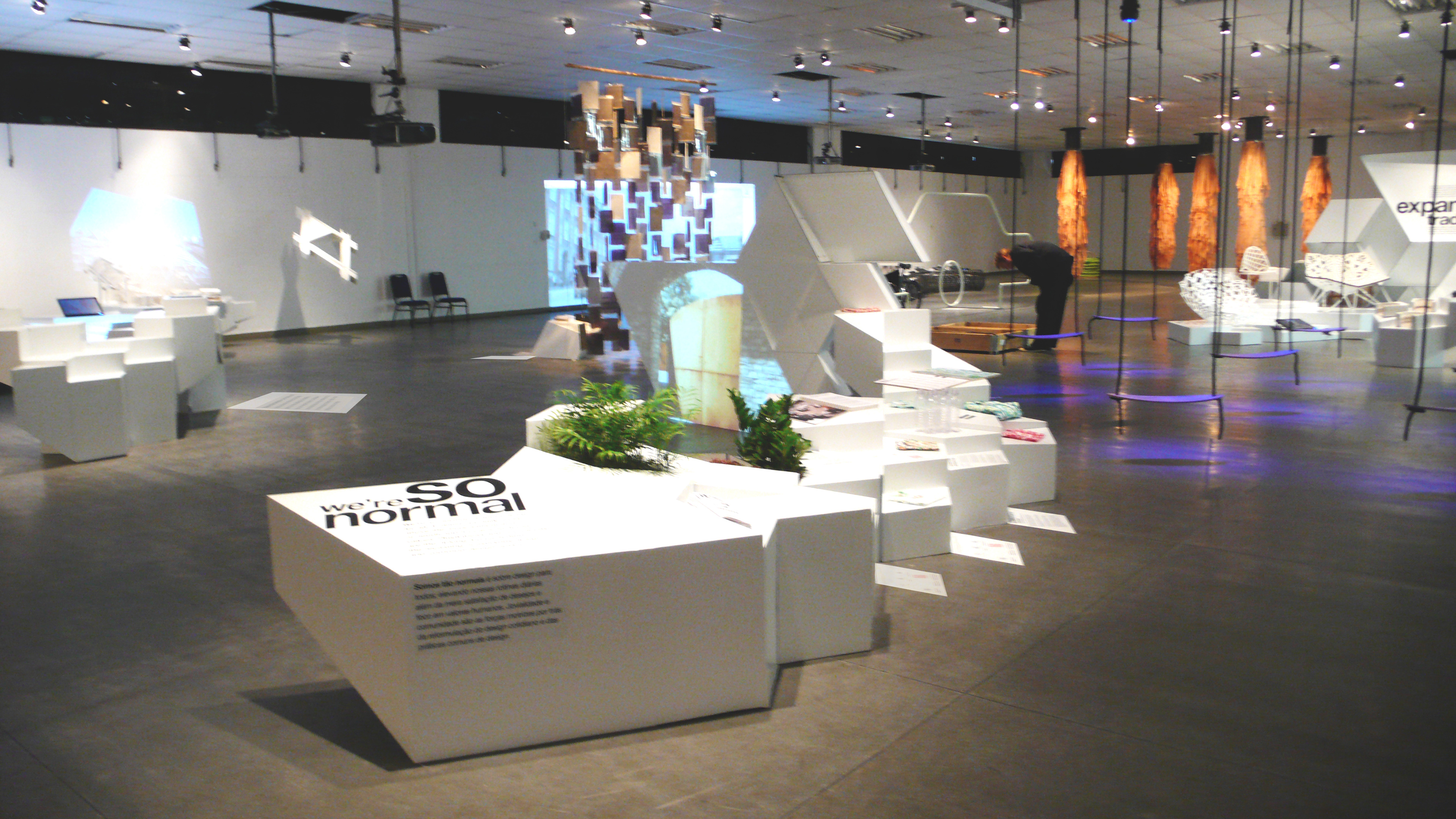
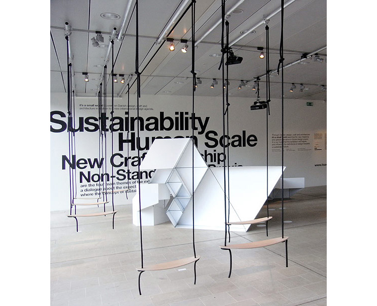
The travel exhibition "it's a small World" was curated and developed as a collaboration between DDC, DAC and Danish Crafts. The very text heavy magazine/catalogue was designed in the classic typeface Helvetica, to link to the logo, but also as its many variations and clean signage was ideal for presenting the dense amount of text. The same modular principle in the shapes of the exhibition was used in stickers and signage/wayfinding on the floor. My role was aiding with creating versions and expanding the design in signage, web and magazine to various languages and exhibition-destinations. Modular principle created by CITA and beautiful Art Direction by Homework.